The serenity of neutral color schemes has a significant place in interior design. However, it is more about the fear of color that I approach this article today. Committing to color arrests most people – they want it and admire it but are fearful about selecting and committing to bold colors.

However, that is not all that causes clients to reach out for assistance. Even if they have made a decision about taking the leap, it is how much, where and with what or to what the color is applied or occurs.


I remember when architect Antoine Predock’s project for United Blood Services in Albuquerque https://bit.ly/3LBQbDv made a splash – a really RED splash when he stuccoed the entire exterior brazenly brilliant, bold, blood red! It was astonishing – astonishingly effective!!! https://bit.ly/3NNQihd If a picture speaks a thousand words, color is right there in conveying remarkable communications.
From branding to personal style, color is key.


My staff recently investigated information from projects. They posed questions and gathered observations regarding my use of color. Photos, at the end illustrate some specific color decisions and why. The resulting questions and answers are as follows:
Patti Hoech ‘s design practice has been and continues to be an exploration and emphasis of the subtleties and strengths of color. It is an integral part of her work. We wanted to know why and when she discovered this specialization in her design sensitivity and how it relates to her approach to effective design decisions. We are asking clients and colleagues to pose questions to get the answers.
Why is color so important?
- Patti Says: Color is power and peace. Color is important on so many levels – personal joy (or aversion), perceived temperature, brand identification, seasonal interactions, emphasis, and contrast. Color is everywhere. Understanding and harnessing it for specific purposes is key.

How do you determine the color specifics for your projects?
Patti Says: What color brings you joy? What color tells your story? Interviewing clients about their color preferences – being an important question begins the dialog regarding what colors to incorporate and why. This can be personal preferences or aversions or specific colors relating to branding whether it is new or existing. Also, existing fixed design/architectural elements might also play a significant part in developing an effective color scheme.


Do you believe color affects the lives of your clients in their homes and workplaces?
Patti Says: Absolutely!! Color can insert many subliminal effects that impose on people’s perception of a space or graphic. Color can evoke emotion, instill comfort or agitation, rekindle memories, spur appetite, affect perceived temperature. It can embed recall for commercial brands. Color can be a clever tool.

How do you navigate color trends?
Patti Says: Trends are necessary to keep our market moving. Capitalism is based on consumer activity, and nothing generates purchasing frenzies like stimulating new trends in the market. However, basing design decisions on trends must take into consideration the intended longevity of the design. Much of color trends are based upon pairings and combinations of color. It is those combinations that can “date” a color scheme – not so much a specific color. It is how, where and with what it is used that pegs it.
Do you feel you are a forecaster or influencer?
Patti Says: I believe that I have imparted and am still providing thoughtful, challenging color consultation to my commercial and residential clients. Having prospective clients request designs based upon others that we have produced is telling and flattering. It means they have confidence in the decisions regarding long-lasting color schemes – if not timeless, in some cases. However, it must be said that design elements that present the color often determine – in many ways – how well a selected color or color scheme “holds up” over time. Considerations regrading patterns, materials, and elements can and might be either improved or modified over time while maintaining the same color scheme. Forecasting anticipates color trends. I have successfully influenced clients to make selections based upon an anticipation of future color directions in the market or merely go with classic combinations that have been proven over time. . .


What has influenced your appreciation for and interpretation of color in design?
Patti Says: It started at an early age. Observing the world around me. Nature, architecture, decorative arts (china, textiles, artwork), fashion, logos/brands, trends, regional colors, seasonal colors, cycles of color…Pinks, turquoises, yellows of buildings in the West Indies, bold color statements of Mexico…Color is profoundly important and signature in its application. From fish to birds, flowers to leaves – color captivates me and urges me to find words to express it and continue to have it a primary part of my descriptive vocabulary. As an omnipresent element in the design process, color is unavoidable, but to enjoy it so fully and embrace the limitless range of options is an exciting artist’s pallet of possibilities which stimulates me at every turn.
I attribute much of my color awareness to my mother. I remember being greatly influenced by her sense of color and design. Her sensitivity and talent were innate. She selected fabrics that had unusual color and pattern combinations. When orange, avocado, brown, and gold prevailed in the 60s and 70s, she selected the olives with chartreuse and gold for the less formal areas of our lives and leaned into Lily Pulitzer’s dynamic colors and patterns for her clothing and a pastel version of soft pinks and verdant greens for our more formal areas. The master suite was primarily yellow with beautiful bits of blues. Beach scenes always emphasized blues and greens. Nothing in our world was on common trend, but an artful interpretation of color combinations, eclecticism and comfort. Pairings of orange and brown were never her happy place nor was gold and brown. But orange and PINK – YES! Pink and green especially! And browns were recognized in context with stone shades of greys and tans. I believe that sense was greatly influenced by richly organic, textured stone walls of the West Indies – Danish architecture in the tropics where limitless colors of greens and blues punctuated with flowers were all around.
As a result of this of this early introduction to the value of color, my personal spaces reflected similar sensitivities. Beginning with pink in the early years I graduated into blues, turquoise and greens for my teen years. The final scheme, in my room in the home in which I grew up, was a dusty pink, clay, and mocha-rose. No one in my world had that color scheme in the late 70s and it was difficult to assemble. It helped that I worked part time in a design showroom in Georgetown where handling the amazing abundance of fabulous fabrics was a daily inspiration. Throughout my life experiences color has been a constant distraction. Not in a bad way, but rather a noticeable, unavoidable interruption that causes me to pause and take note. Ask anyone who knows me – I stop and remark about color at every turn. For better or worse, I comment on color. It is a deep appreciation that I enjoy sharing. And the most rewarding is discovering color for clients who yearn for it but don’t quite know how to find and use that which would make them feel the joy of color!

Color plays a major role in discovering and expressing personal style. Fear not – color is your friend. Find your style. Live your style. Love your Style.
10 Tips for Spring Refreshers
March 4, 2017
Like bears coming out of hibernation, people start to stretch and yawn and look around and ask me “What can I do to refresh my interior for spring?” It’s similar to the fall preparation for hunkering down for the winter…”What can I do to cozy-up my house?” as the leaves drop and a chill wafts through the air.
Spring is the season for re-birth and starting fresh. Fresh – what does that suggest? This year we are very fortunate that Pantone set forth the color direction for the entire year – greenery. I have great enthusiasm for incorporating this bright verdant living color throughout the seasons – yes, a color for all seasons – but we are not limited to green in its various forms. I give you permission to add color that makes you feel good. Pick your favorite color…any color!
Now let’s get to that question about “What can I do to refresh my interior for spring?.” Here are 10 tips to change your world and bring joy as spring approaches.
- Color POP: Speaking of your favorite color…”paint magic” as its often referred is the practically instantaneous positive reinforcement that you need to make a quick, effective change in your interior! Pick an accent wall – preferably one that is framed by inside corners (rather than stopping a color on an outside corner) and take the leap of painting it an entirely different color than your norm.
 Bear in mind other color cues in the room so as not to create a discord of color or completion between your design elements – but don’t be afraid either. The idea is a pleasing POP! and an extra pointer, if your room is already painted a decisive color, white can be the accent. Yes, white can be an intentional color accent and not the lack of color that it can often seem to be.
 - Live Plants and Flowers: Spring suggests flowers and greenery – to watch them grow toward the warm weather, bulbs inside can be fun, bouquets of your favorite flowers, sprigs of greenery in a small vase can even be enough.
 A bud vase on your bathroom sink counter, a statement piece at your entry or coffee table, a flowering plant with young buds to last a few weeks, a fern to add feathery freshness. – any and all of these can add life to your interior spaces. If you have flowering trees or bushes outside, this is the time to cut a few branches and bring them inside, place in a vase with water and the warmth of your interior will “force” the buds to bloom – Voila!
 - Reupholster to Refresh: Do you have a tired piece of furniture that might deserve a new fabric? A favorite comfy chair, a hand-me-down of sentimental value, a good frame (bones) that can be salvaged to new with a change of printed fabric, leather, or woven textile. This furniture facelift is just the trick to give new life to older pieces.
4. Change It Up: When you move things around and rearrange your furniture, artwork and accessories you will be surprised how you can refresh without adding anything new. Take a look at your furniture arrange. Can the same pieces be rearranged in the same room and create a new look?? Might you move one piece out to another room or bring in a different piece from some other room?
5. Pillows to Toss: Throw pillows…throw them out! Well, I exaggerate a bit, but cycle them into a bag in the closet for another time or place or “recovery” and find some fun new pillows to brighten and refresh your interior. What an effective change a few colorful pillows can make in a room!
6. Add Art: DIY or find something to cheer you! Dressing your walls with new work can lift your spirits! 
- Fresh Fragrances: Like Votive’s Pink Mimosa or Skeem’s Current Mangosteen scented candles, or Vance Kittera incense will add a dimension of sensory appreciation to refresh the stale, stagnant air of winter.

- Wipe and Dry: New dishtowels are a great and simple boost to change seasons! Find some fresh and uplifting colors to brighten your kitchen and make wiping up more fun! They make a great gift too!
- Stash Your Throw: What’s that afghan on your sofa or that blanket on your bed? Switch out the dark colors of winter with fresh new accents to add color and cuddle in too!
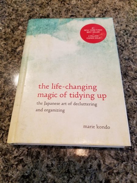
- Get Tidy: Marie Kondo has written books about it- she knows the “life-changing magic” that getting organized and tidy can do for you!
 Spring cleaning is a great therapy and introspective look at the things you own, how much you have and what is clutter beyond your ability to enjoy it all.
Design Dreams Come True – Custom Collection
February 19, 2017
Designing is great fun. But the key to completing the circle that starts with an idea in response to a need (or not) is having that design come to fruition. I am grateful for having a great team of detailed design fabricators who make my dreams come true. And they spoil me. I think many designers will say the same thing. What starts on a cocktail napkin, torn piece of flimsy trace off a roll, a sheet of graph paper or more formally, working drawings, takes shape with the collaboration of designer and fabricators who are not just fabricators, but invaluable contributors to the finished products’ construction and design details. These are the seamstresses, upholsterers, carpenters, iron-workers and all manner of construction trades who bring these creations to fruition!
Several years ago we had a client who was daring in her desire to have a super modern loft. Her history of traditional furnishings and up-bringing was well in place in Washington state, but this opportunity to have a second home, an urban loft, made way for her exercising the juices that offered a new alternative lifestyle and a new “look.”
One of the many key pieces in this fabulous space turned out to be the cornerstone of a new custom collection that we fondly call PATRICIAN DESIGN’S “Hammered Home.”
As I planned the pieces for this fun and hip urban interior, I designed painted pieces, modern tonsus, a Nelson inspired coffee table, red and raw steel glass-topped dining table base, a new take on a drop-leaf desk and colorful mixed media end-table/chests all custom fabricated by my team, but I wanted something more, something that gave rich, detail and dimension, interest and art and this new line of custom furniture was born. The first piece, a nightstand/end table for a dual-purposed guest room/study combined clean-lined wood with steel. So with a quick sketch of the dimensions and form, my desire to have metal legs suspending it off the floor, metal accents but not severe – I thought, hammered?
The wood tone was to be a more milk chocolate than mahogany but tight-grained and true medium brown. The floors were an existing light engineered material and this brown contrasted nicely.


The next opportunity to introduce this combo theme of our “Hammered Home” design came with a young family’s need for a media armoire in the “family” room. Several years ago when “espresso” hit the design scene for the new trend for modern furniture, everyone from Target to Pottery Barn to Robb & Stuckey filled their inventory with the dark coffee bean wood finish. As a designer, I recognized the value of the trend and wanted to accept it, but take it a step further for these very smart and successful, yuppy clients.
In previous blogs, I have clearly stated that all trends are not created equal. some are passing fancies of color combinations that soon become dated or design elements that don’t leave a significant mark to pass the test of time. But the dark chocolate/coffee color enriched that which had so often been blond, light woods and cherry/cinnamon tones of recent popularity and contributed a valid alternate stain theme for wood furniture. The media armoire for a young family’s “family” room, was clean-lined and new. The bling was industrial enough not to be glitzy, but just enough silver-grey metallic to contrast against the dark wood.


The next version of this “Hammered Home” collection came in front of a stacked sandstone wall of bone white, creamy cream, a hint of gold and a tinge of iron rust. We picked the darker rust tone to contrast against the otherwise soft light stone wall colors – the rusty hue suggested a cinnamon colored alder – stain magic! This pair of low profile media cabinets housed all the components and an incredible bundle of wires streaming into the back of the cabinet from all points of the house – and it’s called wi-fi? Really? Due to the color scheme, we decided that a copper metal panel would really meld with the cinnamon-stain of the alder. So we took it a step further to enhance the copper, knock it down a bit and highlight the texture with a blackened rub that nestles into the hollows and allows the bas relief to shine. It is a warm, rich, dimensional textural wonderfulness.


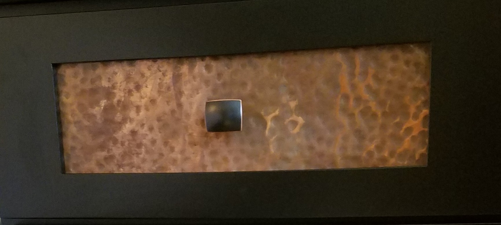
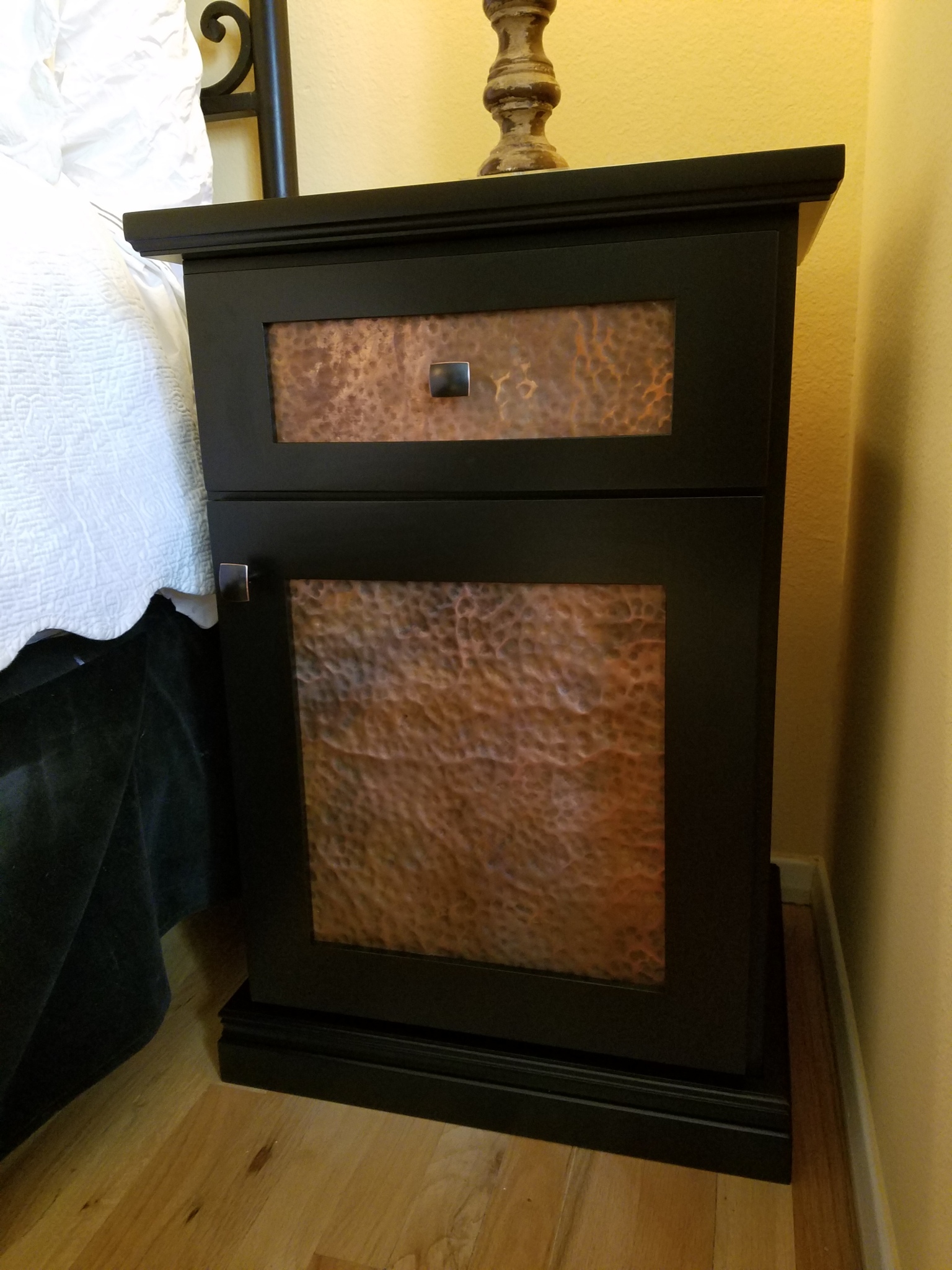
So when a very fun client called last fall wanting a surprise for his wife – nightstands perhaps? I laughed because my husband often says that he’s getting me storm windows for a Valentine’s Day gift…funny – every girl’s dream!! But nightstands are at least in the realm of dreamland!!! So knowing the room and its existing color scheme, I decided upon a satin black with the same hammered blackened copper panels. The combination of the black and blackened copper was sensational. The style was more transitional than the previous clean-lined pieces – but it goes to show that this hammered metal design theme can transcend the styles…
We LOVE working with this client as he knows that he either has an idea (a new nightstand) that we can create or he calls and asks – what can we create for the next event? Whether birthday, anniversary, Christmas, or Valentine’s Day – we have provided locally hand-loomed textiles wraps, wild embroidery throws, magnificent oil paintings, locally hand-crafted jewelry and more! How fun for him to know that each present is custom and unique, supports local artists and will be a treasure forever. Plus he doesn’t have to shop!!!!!
So we delivered our surprise cabinet last week on Valentine’s Tuesday, I stopped at a quickie store and bought some simple heart stickers – not much larger than a postage stamp, I stuck one in the drawer and one on the shelf of the lower cabinet and thought that whenever she opened this cabinet she will remember that it was her Valentine’s surprise!!! We had a key, took the cabinet to their bedroom, removed the old nightstand, replaced it with the new one…Voila! She came home to a really neat surprise!!! And might there be a matching one in the works?? We can’t say.
Custom fun – support local artists and make your dreams come true!!!!!
Valentine Expressions
February 11, 2017
You know…we designers design for our clients and ourselves around themes, we design around events, we design around seasons and of course we design around the trends…it all keeps the commerce of products and materials in motion. And at this time of year, we see focus on wine clubs, pajama grams, stuffed teddy bears in enormous sizes, hearts, hearts, hearts…and roses natural red or gilded, it’s Valentine’s Day!!!
But it’s fair to note that all seasons have valid design consideration. Setting the scene, enhancing the moment – either for you, your family or a romantic encounter, the holidays and especially this one, evoke a desire to create a scene that conveys love and romance.
To that end , my blog is brief. Enjoy that which brings you joy. Revel in the happiness that presents itself. Create beauty where you can. And as we are wont to say….art and good design can almost always bring a better scene to anyone’s place on this precious planet.
So be it a candy heart with a common message of joy, a product acquired to create a scene, a piece of jewelry to promise, a token to send love, a greeting of friendship, a message to offer support, it is all about connecting.
I decided to paint a bowl for my sweetheart. Yes, I had passed this guy’s booth, encouraged others to partake, had appreciated his talent, but never ventured forth. This year, I enjoyed sitting alongside Victor in the shade, with the waves lapping the beach, and soft music wafting through the air…allowing a moment of focus on an artistic expression, a blank canvas (my bowl) to say Happy Valentine’s Day to MY Valentine.


Here is the finished result.


Connecting. We at PATRICIAN DESIGN support local artists and hope that the next time that you need a gift, want to send a message, or desire a creative addition to your personal space, that you will consider local talent to fulfill that need. OR do it yourself DIY!!!
Wear ART – Shop Local – Support LOCAL artists – Need we say more?
Ok…we provide the greatest FREE gift wrap to get you on your way!!!
XXX000 Happy Valentine’s Day – (it’s Tuesday – better get prepared!!!)
PATRICIAN DESIGN
The Excitement of Design Updating and Transformation!
February 4, 2017
For years, Barcelona Tapas has been a creatively successful culinary and social scene on a quiet cobblestone backstreet in the tropical, seaside, destination of Puerto Vallarta. The vertical profile of the sun-bleached white building is distinctive with its open spaces – dining rooms on each ascending level.
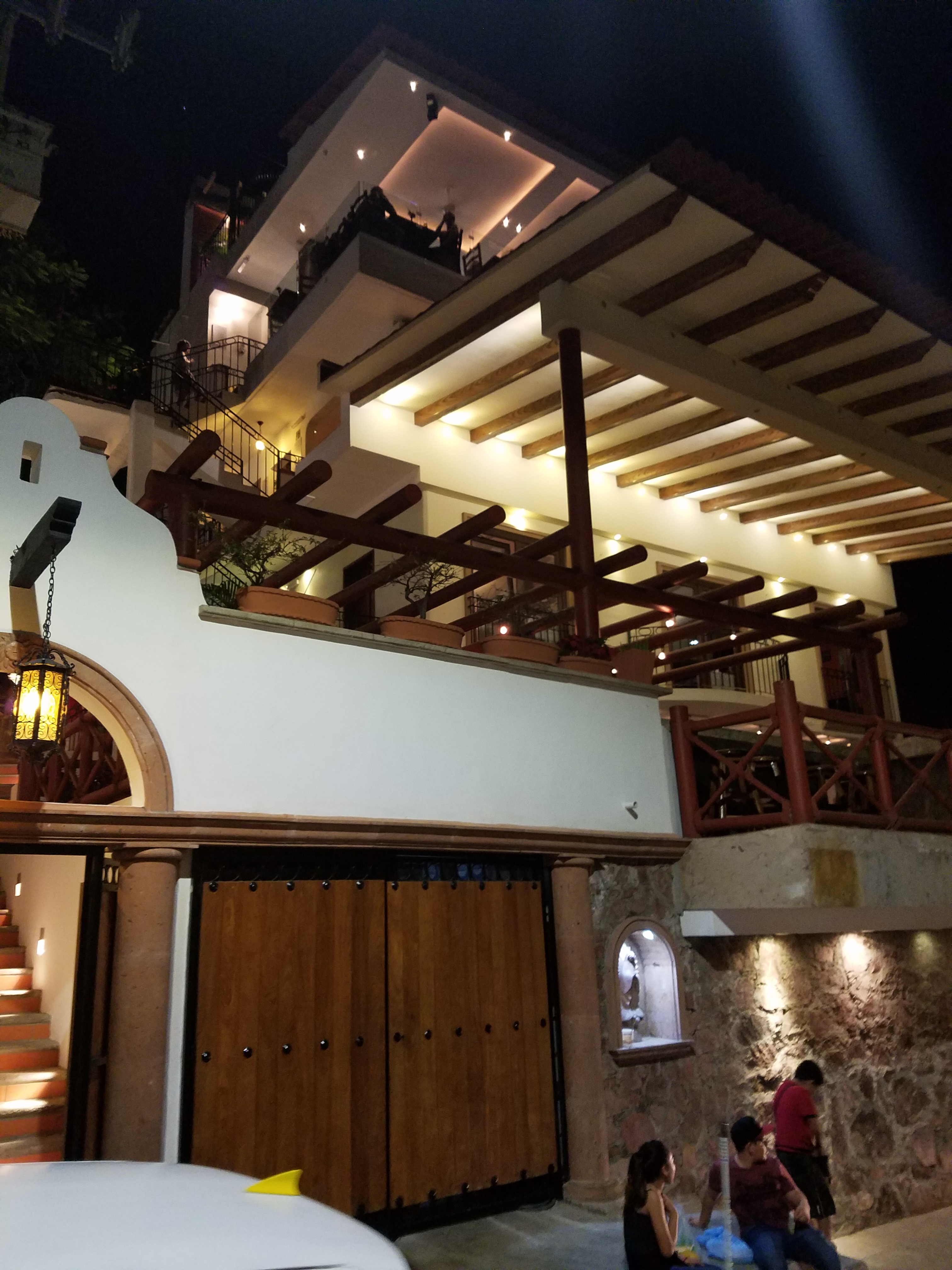
It is a extremely popular, hip and happening, dining venue which has recently had a spectacular face-lift that brings the structure and open-aired/interior environment up to par with the culinary delights.
Upon arrival, the familiar, welcoming doorway opens to softly lit aggregate stairs that sweep up each tier of the towering edifice.


A massive Cantera stone fountain babbles gently amidst tropical plantings and an iron grill-work is indirectly illuminated for a dramatic effect. An expansive patio all with honed stone tile floors begins the layers of available spaces.


Next an intimate open-aired dining area with an adjacent chef’s table and luminous, full-wall wine cooler beckons with an inviting aura. The intense red drama of a bullfight is rendered in a large painting on the rear wall – a suiting backdrop to the Spanish theme.
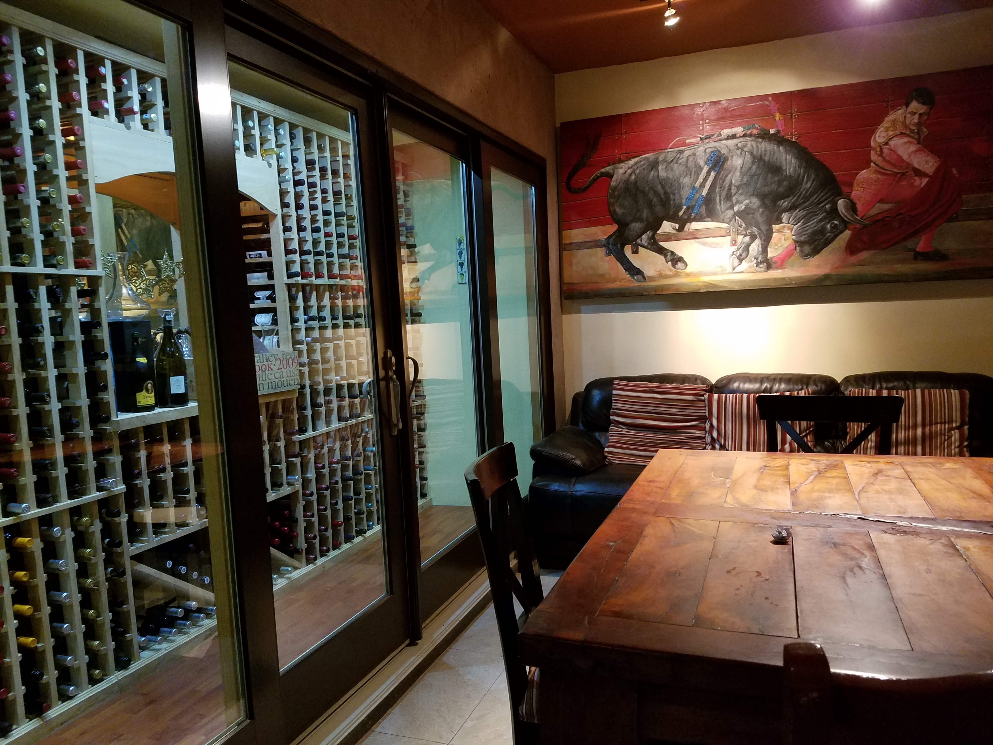
Continuing the ascension, the delightful glossy black ironwork railing follows along and up the open-to-the-sky aggregate staircase turning past the last landing. Ahead, the beautiful, warm glow of the new dimensional ceiling treatment accented with wood and indirect lighting draws the eye upward.


Upon arrival on this rooftop dining platform, what was always an exciting view of the city lights, both in the foreground and circling the bay miles around to the north, now expresses the new architectural features and finishes dazzling the eye.


Effective lighting, recessed ceiling details, a new clear glass railing, and modern ceiling fans dangling like detached white nosecone propellers present a whole new, fresh, modern look. The drama and effectiveness of the lighting paired with the wonderful surround sound, coming from eight Bose wall-mounted speakers and 2 sub-woofers recessed into the ceiling, result in an atmosphere and music that are seductive and sensational.
But wait – there’s more!!! Yes, an additional rooftop dining patio is revealed upon discovering the hidden staircase at the far end of the bar. New furniture and a billowing fabric-draped portico are soon to arrive!
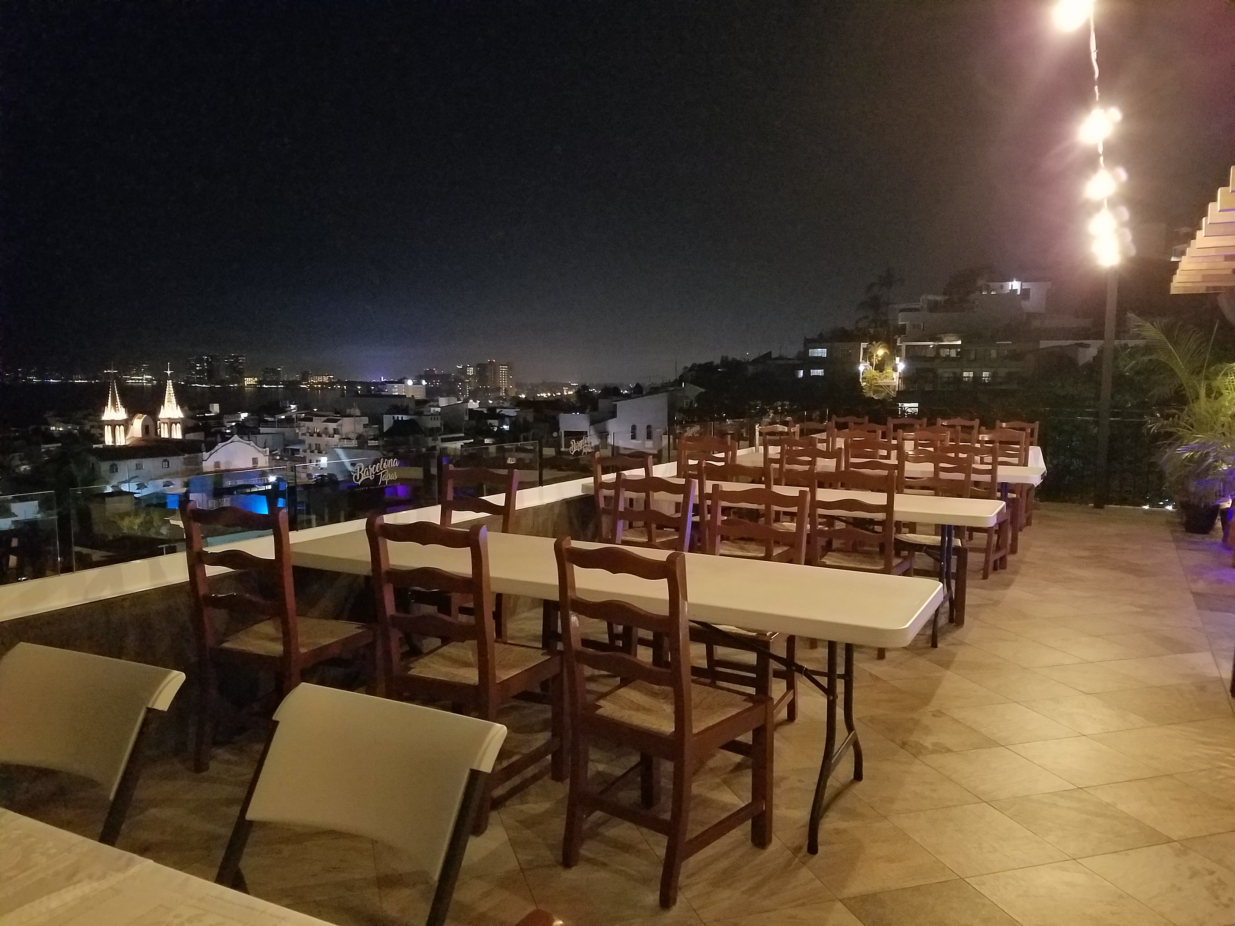
This new space not only increases the seating capacity, but offers yet another panoramic view and trendy design-themed open venue – expanding the options even more!
The project is Chef/Owner Bill Carballo’s passion.

He has been at it for years creating deliciously original and traditional Spanish tapas (here his exquisie presentations have been half eaten in the rush to enjoy)


from the immaculate exhibition kitchen at the start of the long bar, with a fine-tuned staff eager to assist and cater to your every need.

This enchanting transformation has attracted new discriminating, trend-setting clients and welcomed the return of loyal fans to experience this exciting new and stylish interpretation of Barcelona Tapas.

The doormen Luis and his affable sidekick are there to greet and assist!


Thank you gentlemen and Buenos Noches until next time!!!!
Hearts Are At The Heart Of It All
January 29, 2017
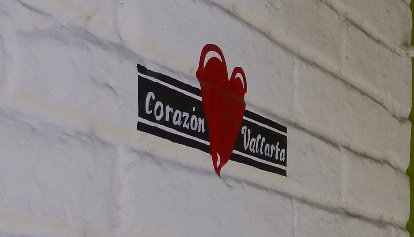
Su mundo es corazones. Artist Paola Alonso Rangel is at the heart of Vallarta and literally that is the name of her shop, Corazon Vallarta, where she thrives amidst the bustling activity in the old town, on a busy street corner, with much traffic flowing by both in vehicles and on foot.

A man carrying a frighteningly large pane of glass about 6 feet long by 3 feet wide effortlessly and without intimidation marches down the street with taxis and buses bouncing by him. I cringe at the site and the young shop attendant, Nidia, shrugs with a smile and says “It’s Mexico.”
With Valentine’s Day nearing, this exciting little shop offers a wealth of opportunities to find just the right gift to say “be mine!”
Paola’s little Chihuahua, Pecas (Freckles), suns on the front step seemingly oblivious to all the activity swirling by. She is front and center of all that is happening in Corazon Vallarta.


A designer and hands-on artist of nearly everything she sells in her shop, Alonso Rangel is a model of organization and time utilization. She has her machine fine-tuned and knows just what it takes to create, prepare, produce and market her work.
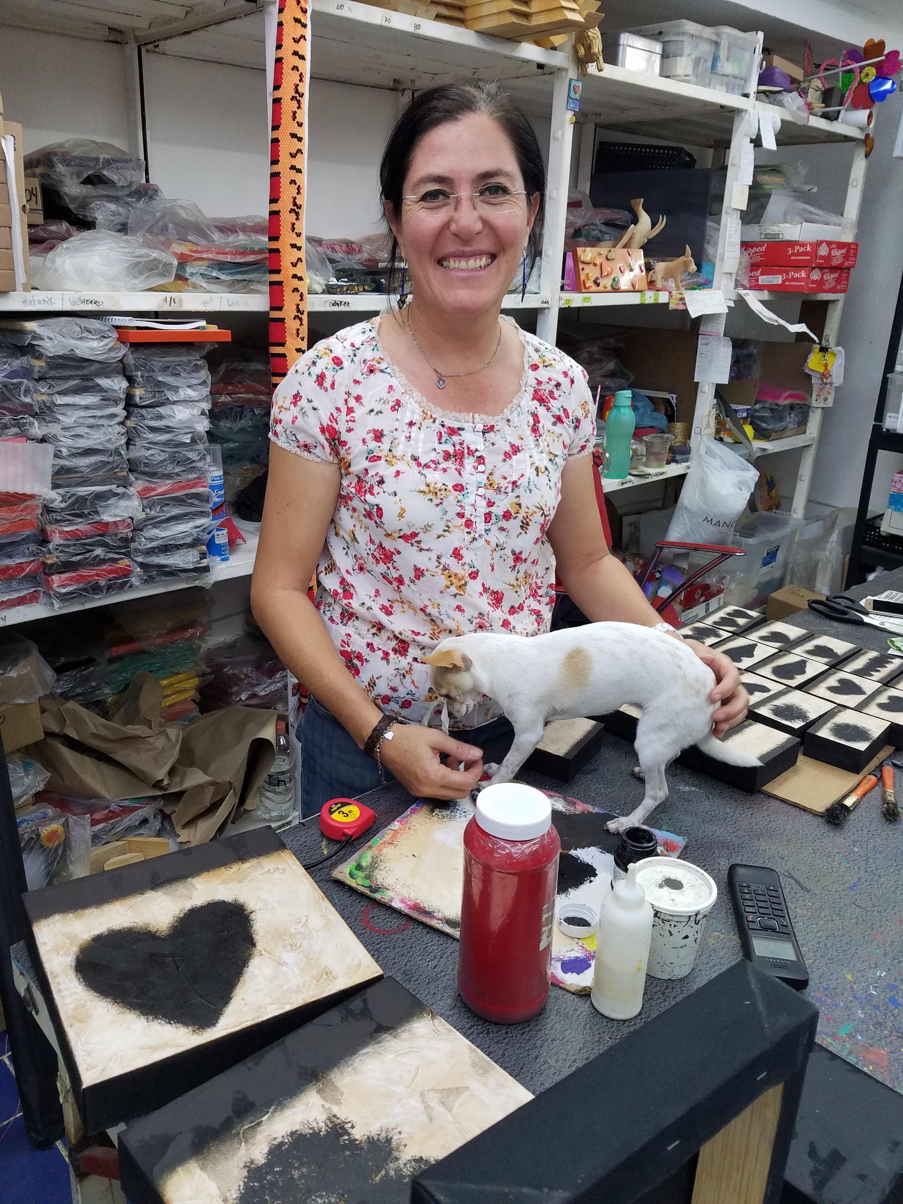
In the well-lit back room of her little tienda, she has all of her art supplies neatly organized on sturdy shelving sparing not one square inch of available space. Her computer plays soft Spanish songs that, with the fan blowing gently, creates a pleasing atmosphere where she designs and paints with a couple of assistants to assemble and package her work to sell.
As is true of most urban storefronts, the fine grit that is continuously accumulating from the dusty streets and vehicles in passing contributes to the concerns of successful retail presentation. Hers and others in this type of scene perhaps suffer more due to the cobblestones which collect and distribute ongoing layers of the sooty, dusty, fines. So everything is kept painstakingly clean and wrapped in cellophane – just another stage of the process that makes her conscientious practices so impressive.


From colorful wooden puzzles, picture frames, key hangers, boxes and magnets, the expansive home decor and gift collection, on which she collaborates with her brother in Guadalajara, is a treasure of her designs and creativity. All manner of colorful animals with whimsical expressions are the subjects of her puzzles with a bit of flowers and fruit in the mix for a generous variety of choices. Alonso Rangel designs all of the pieces while her brother and his crew with a manufacturing studio in Guadalajara do all the mill-work, brilliantly colorful painting and glossy lacquer finish.

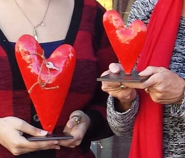
Other of her work is comprised of original one-of-a-kind creations on canvas and wood, heart-themed all in keeping with her heart-felt passion for corazones.


She efficiently sets-up her own assembly line of stages of production, with Pecas supervising closely, so that each of her made-by-hand (hecho a mano) originals are always filling the walls and shelves from where they are being lovingly selected by customers to take home.


Steel heart sculptures, wooden cut-outs, carvings, and more are the multi-media of her continually, seemingly endless creative concepts and body of work!
Thank you Paola for all of your inspiration – by design!
Nature’s Valentine’s Greeting!!!
January 21, 2017
So when you least expect it…nature speaks. On a silent coastline on a great lake in the wilds of Wisconsin the stones on the beach offered a hidden alphabet of opportunity. Upon making this discovery, I searched for and collected just the right pieces and sent a love note to my sweetheart. Wishing he were there to share in the wonderful adventure that was hiking through the enchanted woods to this lakeside hideaway, I did the next best thing and found an expression of LOVE , took a photo and messaged off to him…technology and instant gratification – well, across the miles…

The lovely white stones were amazing…I don’t know the geology…could probably Google it, but suffice it to say they were white and soft, angular but smooth, bleached and clean – massed in a thick bed for miles along the shoreline. I wish I could have taken buckets of them to do something…fill a large snifter, layer in the sink for the water to spill over and remind me of this scene, touch and fondle – they were so special, so uniform in size – such a natural phenomenon of raw beauty.
Paired with the rough, elegant, weathered, driftwood that was scattered along the rubble and upon which I carefully placed the stones, the composition was truly a work of art – inspired by nature and assembled by my eager fascination with the media.

Take away…love is all around – OH! has that been said before? Well…love IS all around us and to find an actual, natural formation of alphabet letters that allowed the simplest expression of literal words, to be transported across the miles, was magic.
Art…design…nature…find it!!! Happy almost Valentine’s Day!!!!
Would A Love Letter Be The Same Without Handwriting?
January 17, 2017
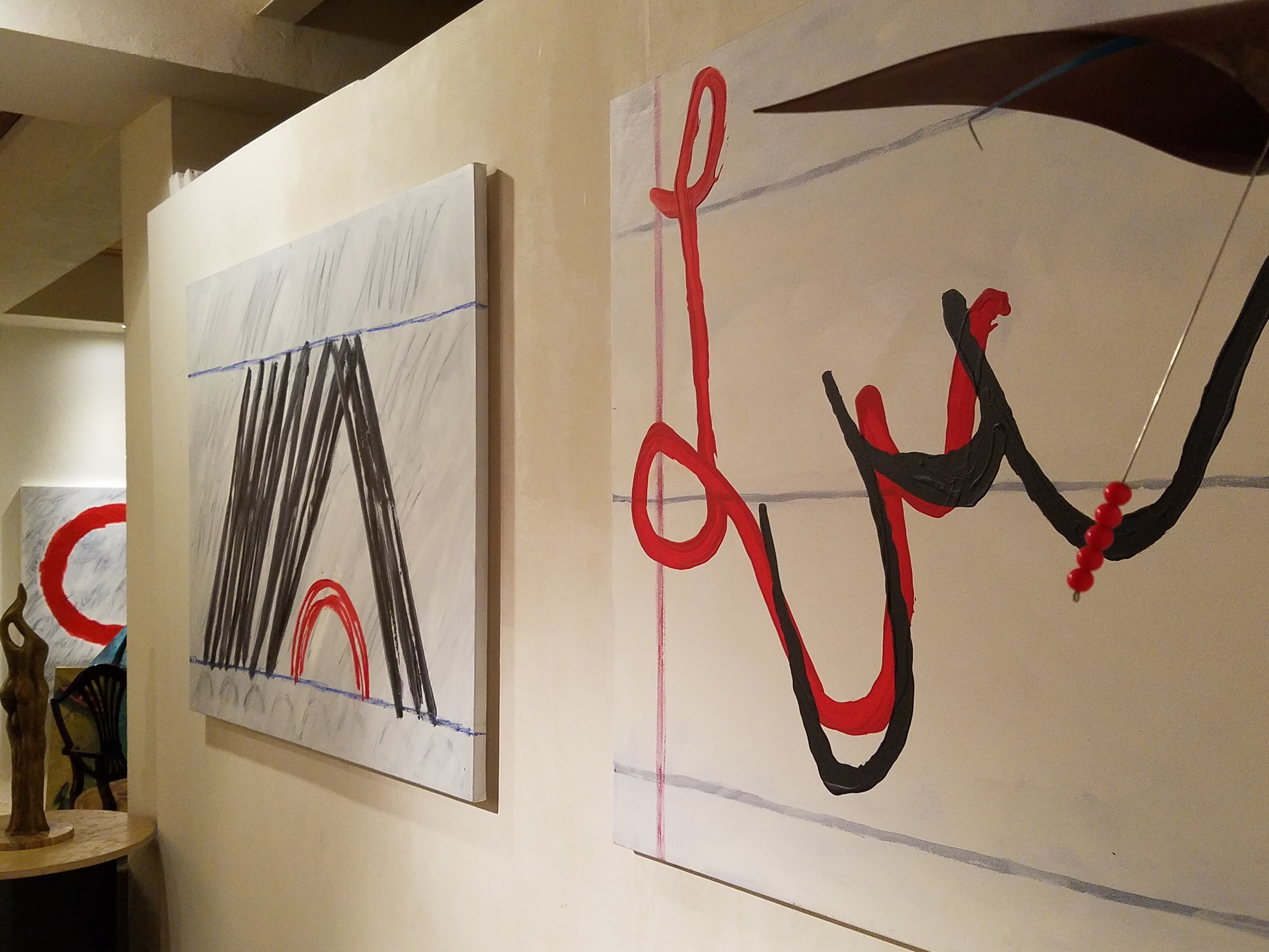
After having seen Federico Leon de la Vega’s presentation at TEDX Talks in September and after having seen some of the work in progress over the past couple of years, it was a treat last week to be in his studio to see the collection exhibited up close and in person!


Presented on fabulously enormous canvases and a few smaller studies, these bold graphic statements compile a contemporary collection that is quite astounding. The premise is quite provocative.
The idea that handwriting is a basic human means of communication having evolved into the very personal flowing script of cursive that each individual can call their own – in their own style – it’s almost as personal as a fingerprint. It is an extraordinary human function that should be protected, revered and certainly not lost to the fast-paced technology of the digital age!
Making one’s mark on a surface…a piece of paper…to convey a thought, idea, instruction, story, a doodle on a paper towel – a love letter.

With Valentine’s Day approaching, it brings to mind the idea of love letters. We read them throughout literature and listen to them in songs. We hear of them being saved over time by recipients in treasured boxes tied with ribbon to be read over and over or merely saved for others to find long after…
These magnificent oil paintings convey the art of handwriting. They celebrate the simplest marks of hand to canvas with brush and paint looping in circles and jutting in spikes – the primary strokes of handwriting. These primary strokes are the foundation of mastering the control needed to make the continuous flow of letters that become each person’s personal interpretation of the alphabet in cursive style and an exclusive means of communication.
Style – handwriting conveys personal style. Look at yours. Is it always the same or do you mix it up? Do you stay consistent or do you express different styles of your own handwriting for different purposes? Look at your friend’s handwriting – would you recognize it anywhere?

It is thrilling to walk among these great canvases with their color and bold strokes. It is arresting to realize that they are so simple yet so complex in what they are saying. We must recognize the value of handwriting. We must not let it be dropped from our schools’ curriculum. We must continue to see the importance of the pure, mind to hand, raw emotion.


Powerful spikes require starting and stopping – control.
Loose loops also require control to maintain uniformity.
After control is learned, expression can take over resulting in that personal style that becomes each individual’s identifying handwriting.
Federico reminds us in his talk, about how we might have attempted to write a love letter for the first time and how many times it was crumpled because it wasn’t quite right. The failed attempts of recording our feelings as we strive to say the right thing, to express our deepest emotions. Yet once accomplished, those words hand-written mean so much more than the same words conveyed by type or digital communications.


“From my heart to my mind, from my mind to my hand, from my hand to the paper I place in your hand, so you may fold it and keep it near to your heart. No delete!”
The digital world is all around us. We cannot escape it, nor should we. However, the human evolution and the brain’s development that mastered the art of handwriting is a place that could be diminished and lost if we do not continue the art and practice of personal expression through this extraordinary medium.
All we need is love – sent via a personalized handwritten letter from the heart. Here’s to a Happy Valentine’s Day !!!
Let There Be Light for the New Year!!
January 1, 2017
Short days and longs nights…Do you find that your interior is dull, lifeless and even feels a bit cavernous after dark? As the sun sets and the lamps come on, the effects can be horrible, adequate or sensational.
Poor lighting can have remarkable subliminal effects on mood, energy, and attitude. The subtle signs of poor lighting such as dark corners, shadows on faces, difficulty reading and dull colors are all important factors that contribute to an uncomfortable interior in these short days of long, dark nights.
Lighting has multiple reasons for being—three primary ones—to see, yes, ambient light. But to do tasks (reading, sewing, playing games), and accent lighting to illuminate artwork and other interior features. Mood lighting such as candlelight (once the primary light source – now an effect in most cases) is a lesser but effective lighting tool. Good lighting makes amazing differences.


Beware of down-lights. Lights that shine down from the ceiling. Although a very effective and common lighting tool, they must be balanced with good ambient light. I have often used this example of sitting in a restaurant across from your date and their face is painted with ghoulish dark shadows under their eyes, beneath their nose, and accentuating all the folds of their features. It is the opposite of a kid putting a flashlight under their chin shining upward creating similarly haunting effects. Creepy. Certainly not flattering.

The same unpleasant effects happen in the home. It’s such a common malady of ineffective lighting that most people assume it is a necessary evil of short days. It’s sad—no, really it’s SAD—Seasonal Affective Disorder! To treat the serious effects of this syndrome there are many studies and inventive solutions, but for most of us, the less arresting effects of poor lighting can be greatly improved and our lives enhanced.
To begin this process of evaluating your lighting an improving it right away, start with the lamps—the light bulbs! We have so many choices these days including the familiar incandescent, compact fluorescent, and the newer LED with excellent color choices and low energy usage. We could talk about the “temperature” of light sources measured in Kelvin, but we won’t—only that it runs a spectrum of warm to cool.
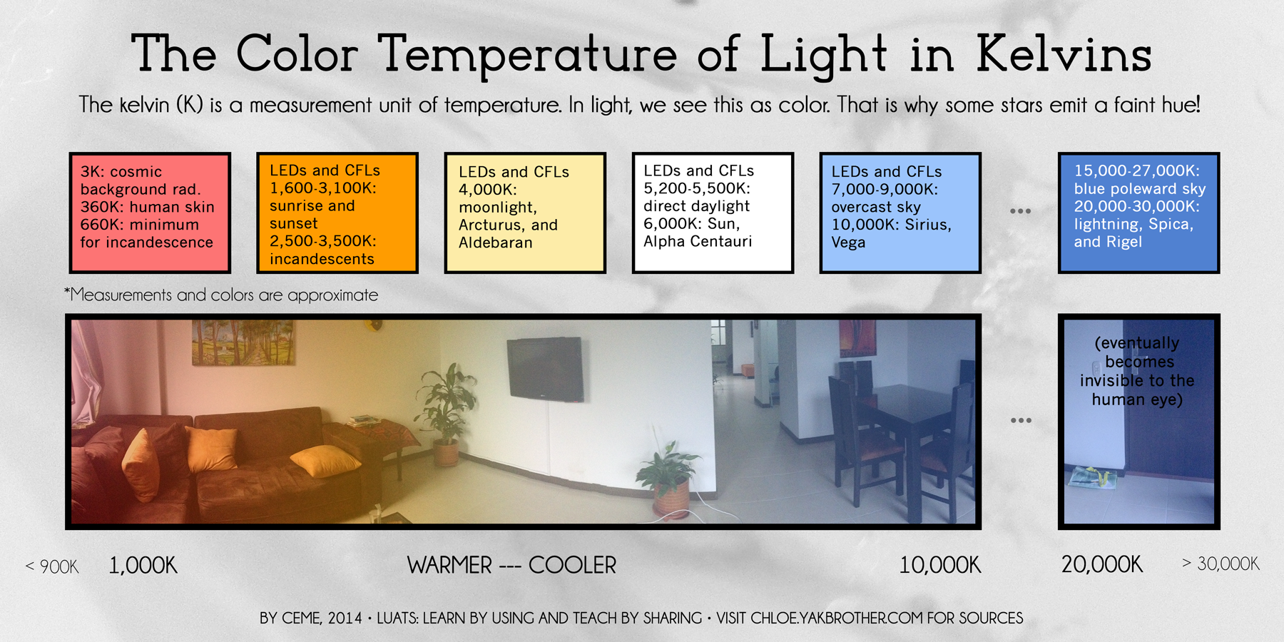
Walk around your home and look specifically at the color that glows from the various light sources. Does it look yellow? Does it look white? Does it look blue-ish? Recognizing these distinctions from warm to cool is the start.
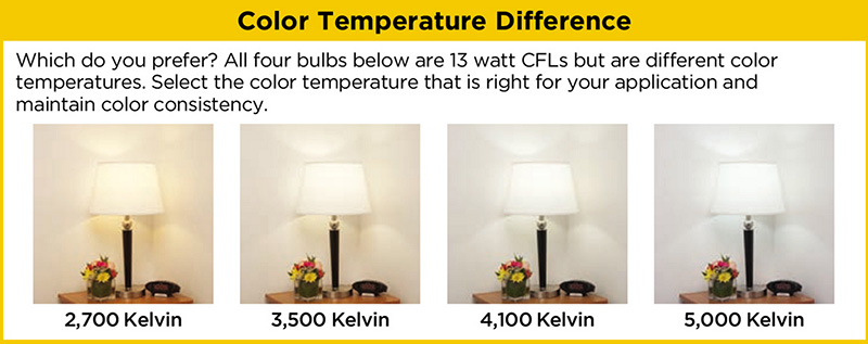
Where are the shadows? Are the corners dark and recessive? And, when you combine these two, do you find, for example, dark areas and yellow glowing sources? Sometimes that soft, warm yellow is preferred while other scenes are made more intentionally crisp with cooler light.
Experiment with different lamps in your fixtures – light bulbs in your table lamps and recessed cans, hallway sconces and bathroom fixtures. It’s a fun experiment and very illuminating – yes, the pun was intended.
Are your lamp shades opaque or translucent? Do the shades themselves cast a color? Do they block the light or allow it through? Do they throw the light up and down or up, down and out? This is another detail of which to take note.


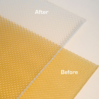
If you have dated recessed fluorescent tube units – common in kitchens for example – they are often housed in a box either recessed or surface-mounted on the ceiling. Take a look at the plastic lenses – are they discolored and yellow? This aging process can dramatically affect the quality of light that is emitted. So if you are not ready to replace these fixtures with more effective modern lighting statements, try replacing the lenses.
A similar installation is that of skylights which have fluorescent lamps up inside the wells with that same plastic lens over the opening to the skylight. The original idea was to have the natural light pass through during the day and artificial light take over after hours. The lens was to intentionally conceal the unattractive fluorescent tubes, but it sacrificed the depth of the framed well. A quick update is to remove the lenses and fluorescents and expose the well of the skylight adding dimension to the room and eliminating the unattractive lens that conceals the dimensional cavity. Recessed can fixtures around the skylight in the surrounding ceiling are the most common solution to this transition from old to new, a cable can be strung, pendants can be hung, but if budget constraints prohibit that investment at this time, you might investigate the power source up inside the skylight well and replace the fluorescent fixture with an inexpensive, adjustable, surface-mounted spotlight – perhaps with two heads to provide light from that same source while opening the skylight well without the unnecessary lens.

The dark pockets around your rooms can be improved with up-lights in corners and up under plants. Inexpensive fixtures are available at any lighting store or big box home improvement stores. Place one of these up-lights (remember to select the color “temperature” that pleases you the most) and see what that additional pop in the corner does to open your space. When up-lights are used beneath plants to shoot upward and cast shadows onto the walls and ceilings can create drama and exotic interest at night. This is true both indoors and out.


Torchiere floor lamps are those that face upward. Like a torch, they send the light toward the ceiling – another effective splash of light in an otherwise dark space in the room.
Colors are radically affected by the color of light that shines upon them. Therefore, an interior color scheme can be horribly tweaked to not resemble at all the actual colors chosen and combined to create the scene, when artificially illuminated after dark. Contrarily, colors can be rendered with great brilliance and accuracy when illuminated with the right combination of lighting. (although daylight contributes in these two examples).


By the same token we can have great fun and “paint” with light creating a color scheme entirely with colored lamps washing the walls, and interior elements just for the art and exercise of doing so, but I digress.

In summary, look around your rooms after dark and look for opportunities to make changes that will dramatically affect the comfort level – the results will be startling!!! If planning new construction or remodel – have plenty of light in key places throughout the space. Think dimmers so you can control the amount of light. Let there be light in this Happy New Year!
The Art & Architecture of Gingerbread Houses
December 24, 2016
Art and architecture meet all the time. Sculptural forms, building models, buildings themselves, sketches…but at this time of year, the fanciful world of gingerbread houses takes the spotlight and, in this recent scene we encountered, offered a beautiful fund-raiser while at it!!!

As we pulled away in the pre-dawn hours of the morning…we felt the chill in the air and the glow over the mountain sending us on our way.
We traversed across the terminal and before cutting over left to the escalator, we spied—at the same time—a wondrously tall Christmas tree adorned with airplanes and ribbon…and surrounded by an amazing collection of ginger bread houses on display in some sort of fund-raiser fashion.

Upon closer inspection, the fantasy became tangible. The individual structures took on a form of expressive life in their individual attention-getting style. Each one was quite unique incorporating rivers and ponds, vehicles and foliage of all manner.


It is a Christmas tradition to create a gingerbread house full of fantasy and fear, hope and salvation. From the simple joy of baking traditions for Christmas, to the many versions of fairy tales that save children from the wicked ones in the woods creating and story-telling surrounding these magical edifices makes gingerbread houses a staple of the winter holidays – all the while offering architectural design and construction projects for all ages. Below, see the Hanukkah version of this adorable house.


I just read a great piece by Tori Avey in which she summarized the history of gingerbread. http://toriavey.com/?s=gingerbread
She references architectural design with the fact that: Elaborately decorated gingerbread became synonymous with all things fancy and elegant in England. The gold leaf that was often used to decorate gingerbread cookies led to the popular expression ‘to take the gilt off of gingerbread.’ The carved, white architectural details found on many colonial American seaside homes is sometimes referred to as ‘gingerbread work’.
Having been raised on the east coast, describing houses with ornate “gingerbread” detailing was part of our vocabulary. I now see it in Rocky Mountain Victorians and California seaside cottages. It always conveys a quaint, welcoming feeling.
Avey further states: Gingerbread houses originated in Germany during the 16th century. The elaborate cookie-walled houses, decorated with foil in addition to gold leaf, became associated with Christmas tradition. Their popularity rose when the Brothers Grimm wrote the story of Hansel and Gretel, in which the main characters stumble upon a house made entirely of treats deep in the forest. It is unclear whether or not gingerbread houses were a result of the popular fairy tale, or vice versa.
Recently the record for world’s largest gingerbread house was broken. The previous record was set by the Mall of America in 2006. The new winning gingerbread house, spanning nearly 40,000 cubic feet, was erected at Traditions Golf Club in Bryan, Texas.
Everything is bigger in Texas!!!
The house required a building permit and was built much like a traditional house. 4,000 gingerbread bricks were used during its construction. To put that in perspective, a recipe for a house this size would include 1,800 pounds of butter and 1,080 ounces of ground ginger. Sounds more like a gingerbread resort!
So as we walked around this wonderful display at the ABQ Sunport and marveled at the colorful creativity, I knew this was the story for today.
The cartoon in the paper that morning also found humor in the subject.

And to further galvanize that thought, we arrived in San Diego to find Keira proudly presenting their half-eaten, already picked apart gingerbread project in the center of the kitchen table. T’was the joy of gingerbread houses—post construction, eating them!!!


