Color of the Year 2017 Greenery!!
December 11, 2016
Ta Da! Pantone announces its color of the year for the coming 2017…drum roll please…and the color is Greenery!! Yay!!! Last year there were two – yes, imagine that – they couldn’t decide so they slurried Rose Quartz and Serenity resulting in a pale, cool, wimpy blend of soft rose and lavenderesque shades into a blended wispy pastel dream. Non-committal, in my opinion…lacking confidence. Last year the rationale was stated by Pantone’s Executive Director, Leatrice Eiseman as…

But this year they have it with this fresh organic hue in a yellow-ish shade primed for this year’s rationale from Ms. Eiseman which is:

I have always loved green. I grew up in a Virginia jungle of a suburban neighborhood inside the Beltway surrounding my hometown of Washington DC. where the first signs of spring were the tiny tips of dogwood leaves poking forth from the delicate branches of those beautiful under-growth trees. The dogwoods were the graceful, human-scale layer beneath the towering canopy of the immense, rigid, vertical tulip poplar and white oak trees that commanded the woods.
Soft mosses, lacey ferns and perky lily of the valley carpeted the hidden pockets of our backyard. New growth is that prediction of amazing renewal and promise of the start of summer. So it is a prime observation that as Eiseman states in her 2017 rationale “greenery…bursts forth…with a reassurance we yearn for…” although I do not feel this is peculiar to this year as winter always makes me yearn for greenery and the reassurance that spring and summer will return.
My mother also loved green and that probably influenced my childhood perception of comfort and context of it in interior design. She had and still has an eye for color. In 1959 she selected an amazing sculpted wool pile carpet in a warm, dark, neutral, taupe tone and built upon it a color scheme of pinks and greens that was subtle and relaxing, organic and contrasting, blending beautifully in our wooded setting of verdant lushness in which we were cozily situated.
That was upstairs where we felt like we lived in a flowering tree house amidst the dense collection of green leafy between the trees and surrounded by all shades of pink and white azaleas. Downstairs, where we retreated in the winter months, her greens were mixed with gold tones creating a warm interpretation of the greenery around us.
When so many in that era, between the 60s and 70s, were styling interiors with heavy oranges, browns and golds,

my mother gravitated toward Lily Pulitzer’s fresh, tropical palette of lime green and hot pinks, clean crisp turquoise and citrusy lemon yellow – both in her wardrobe and her interior accent colors.

Our beach house was turquoise and teal, navy and tan – the sea and the sand.
Following color trends is a slippery slope. I have blogged about it in the past. Adopting that which is often a combination of colors instantly records a place in time when everything from bath towels and shower curtains, bed dressings to draperies appears in the marketplace and inserts its predetermined obsolescent combinations into the lives of so many who would rather catch the wave – often behind the crest – to own and participate in what is conveyed by the market to be the “in” thing to do and to have.
It is best not to embrace and adopt the combinations that the market presents. It is better to select color and combinations that transcend the trends – skirt them so as not to fall into the trap of dated color schemes and tired combinations. Some avoid the trap by staying neutral. The safe, timeless colors of whites and grays mushrooms and taupes- but where is the risk and fun in that?
“Too bad for them” I often remark. It is such a missed opportunity…a limitation to select colors that you think you are supposed to like rather than those that truly bring you joy. I say “go for joy every time.” Color is such personality. It is a stage-setting element. It is a backdrop or foreground. It is a theme. It is an atmosphere.
With all that having been said, I for one am thrilled with this fresh selection for the new year. A bright beginning full of hope and new growth, fresh starts and positive forward movement – organic and life-affirming. So seek the colors that brings you joy and go forth with color in this new 2017 soon to arrive. My personal schemes will always have greenery!!!


Resourceful Creative Festive Fun
November 22, 2016
When it’s time sensitive and just can’t wait – what do you get? A BONUS BLOG!!! Yes! A mid-week blog for the holidays! It began beneath a brilliant blue sky yesterday as the air, with a teeny bit of a chill, was contrasted by the then warm sunshine glistening through a deciduous denuded Honey Locust making it’s lonely leftover pods look like birds silhouetted against the sky.


Scattered all over the ground were the same fallen wonderfully twisted mahogany-colored pods writhing amidst the dried leaves.


The color was so rich and warm it was irresistible. As I bent over to inspect one, I was captured by the unique quality of each pod and the amazing contours of their graceful, elongated shapes.
Almost as though they were varnished, they had a semi-gloss that was naturally beautiful. This is art in nature. This is inspiration. I can see this as a magnificent drapery fabric – a grand wall of these intertwined ribbons of organic seed pods.

However, on a more current and immediate note – I saw a centerpiece or multiple centerpieces as it turned out. I gathered the pods in my fist as though a wonderfully wild bouquet. I then needed a bag (thank you Becky) as I kept dropping them, in an effort to force the ever growing collection.
Here is the quickie result of the awesome autumnal centerpiece. I had a faux wreath of berries and leaves, tossed in a few recently harvested local apples, (thank you Vigils), some leaves gathered from the driveway as the Bradford Pear – which, a little late this year due to our unseasonably warm Indian Summer this fall, has only started to drop its gloriously radiant leaves. And Voila!


I stood back and looked over my shoulder and saw the collapsed plastic bag still spilling pods out over the counter-top.

I was about to call all my friends and ask “Do you want a piece of this fabulous, festive, fall, focus of attention? And I quickly realized I could expand the joy for those of you with grand tables needing a longer statement down the center.


So flanking glass vases provided the extension I needed. Now this was quick – adding gravel, sand or moss in the vases would add interest and depth, maybe pheasant feathers, other dried flower pods and grasses – this was just a start based upon an irresistible inspiration scattered before me.

So keep your eyes peeled for opportunities when you least expect them and make something out of nothing. Save unnecessary expense when you find your design accessories for free!!! Happy Thanksgiving!!!
![]()
Effective Staging & Improvments Clinch the Deal
April 30, 2016
We staged a house this week. We TRANSFORMED IT! Wonderful clients for several years, who I regard as friends too, called to say they were moving out-of-state and they needed to quickly get their house ready for sale. So many things that we had planned to do and more, deferred due to life getting in the way, all of a sudden got put on the fast-track to get finished in less than a month!
When you think of staging a house for sale, you might think of a fall scene scented with stove-top cinnamon sticks warming in a pan. In the spring, as it is now, fresh flowers with floral fragrances wafting on breezes through open windows and doorways. We had the floral bouquets – just a couple – as centerpieces in the dining room and another game table in the family room.


But in order to really make this house attractive to the prospective buyers – millennials and their families – experience tells me that we needed to install profound punctuations of exciting new trendy finishes and colors.
I critiqued the kitchen for its old but good-as-new solid surface countertops with a dated, tell-tale sandwich of speckled forest green in between the bull-nosed edge of solid white. The cabinets were plain slab birch yellowed by time, with hand-crafted wooden handles. To place the emphasis where we would get the most “bang for the buck,” we kept the countertops, refinished the cabinets and added new mosaic tile and paint accents. 
A few years earlier, we had stripped adjacent identical cabinets in the dining area and re-finished them with multiple clear-coats of conversion varnish. In place of the two-screwed wooden handles, we installed three small conical-shaped brushed stainless pulls. By adding the third holes at each, between the existing two of the wooden pulls, the detail looked intentional and contributed to a modernized interpretation of the cabinet design. We now finished the kitchen cabinets to match which had been slated for the same improvements, but put on the back-burned until now. 
The end wall of the kitchen, with a large pass-through opening into the dining room, leaving no significant wall space for art or other accessorizing, was the perfect element for a dramatic, eye-catching full-wall treatment. A mosaic of horizontal glass tiles in earthen blacks and beiges balanced the warm cabinets and maple flooring with a strength, pattern, interest and glossy bling. The same mosaic tile wrapped the room filling the back-splash between countertops and upper cabinets. 
Outside we painted the garage doors, wall sconce and patio trim with a new organic neutral mushroom green shade. The landscaping was enhanced with new river rock and a couple of large ceramic planters were placed by the front entry with mature plants creating a sense of establishment. The plain concrete entry porch was tiled with a dark earthy porcelain continuing up the step and into the entry foyer replacing the burnt orange tile that had been neglected from the decades old original finishes. 
Additional planters were purchased to scatter about – but a more effective idea to have a strong showing of them at the end of the pool anchored that setting with a stunning blue ceramic colonnade bursting forth with brilliant contrasting yellow Celtic Broom. Massing things can often create more powerful statements rather than sparse, weak distributions of the same.


The master bedroom suite had been remodeled a couple of years prior. Pre-fabricated white melamine closet components were replaced with custom fabricated birch closets and cabinetry to continue the theme of the original cabinets in the main level of the home. Updated granite countertops, new lighting and mosaic tiles jazzed the dressing scene and brought order for the young parents running this busy family.


Staging a home requires thinking about clearing the clutter and dressing the scene. But beyond that, looking at more powerful elements to repair and update can make an enormous difference in the appeal to potential buyers. This was evidenced by the comments that we overheard specifically about the more dramatic installations like the new mosaic wall, welcoming entry tile and effective row of blue patio planters that we decided to employ really clinched the deal.
It could have been a sculptural piece of drift wood or a gnarly tree branch from the woods or a twisted piece of metal from a salvage yard…but the idea is to see things in a different way and once again—as I have done this before— to make something from nothing. And in this case, with no effort or manipulation—just the natural beauty of the found object.
The tide was out making the beach so wide it was like a great runway of wet sand. Scattered on the surface were the leavings of the waves – pieces of shell and polished stones. There amidst the beautiful debris was what looked like the suggestion of an abandoned boat hull—a dried, darkened palm sheath. I instantly knew, this would be another beginning of the tropical table-scape that I am so fond of creating when we are at the beach. 
“Creating something from nothing,” my father would often say. He was a great believer in that idea that one man’s trash was another man’s treasure. We loved to beach comb together whenever we found ourselves at the tide’s edge. Sometimes it was tropical and the coral was bleached white and pocked with texture. Fine mesh pieces of purple sea fan and perfect little green “hat” shells would be nestled among the dense collections of heavier piles of white coral.
Then other scenes would find us on northern beaches of the Maryland coast where there was no coral but the ocean would wash multi-colored surf-polished stones onto the shore blanketing the sand particularly at the very edge where the water would curl between the beach and the ocean’s depths. Tiny purple and pink clam shells would peek, being abruptly exposed and quickly bury themselves back into the wet sand moistened with each incoming wave.
On this day, the warm breeze is tropical and the beach is expansive offering rare treasures scattered broadly but sparingly on the pristine surface of sand. It is here that I encountered my centerpiece.
Don of course is saying—”what are you going to do with that? It’s too big. Leave it here.” And I assure him that it is in fact a treasure and that it will be magnificent in the center of our dinner table where we are entertaining 11 for festivities this coming weekend. He, as always, acquiesces knowing that it is futile to stand in the way of my wildly enthusiastic creativity. 

Over the next couple of days, he and I both collect white stones and shells on our daily beach walks. At my instruction, we only collect white unless it is a particularly interesting shell. The idea is to have the stark contrast with the dark hull of the palm sheath.
Our dining table is a handsome slab of travertine marble. Laminated to a double thickness and finely finished with a smooth full bull-nose edge, it is the perfect organic surface to build this also very organic centerpiece.
It needs something…the neutral tones are lovely. Yet, the dark espresso brown of the palm sheath with the white of the stones, against the creamy surface of the travertine invites something more. I realize that it can only be enhanced with another layer of organic material – here in the form of the fresh verdant green palm fronds – the perfect punctuation! 
Oh would that I had collected more flat oyster shell halves…they work so well for votive candle bases…but alas, parrot green cocktail napkins will have to do for this last minute detail.
Our woven palm place mats, in their natural dried flaxen color, compliment the rest of the organics on our table. And as night falls, the sun drops beneath the sea’s horizon and twinkle of scattered candles finish our scene. Salud!
Random Colors in Nature’s Eggs
November 21, 2015
When I opened this cartoon of eggs given to us by friends the other night fresh from their chicken coop, I was amazed by the soft rich color combination that burst forth. And color is so a part of my design sensitivity that anytime I encounter an unexpected scheme, the inspiration is incredibly stimulating. So much so in this case that I created today’s story! 
My friends have a ridiculously chic chicken coop. By that I mean being beautifully white-washed and accessorized including having a crystal chandelier complete with a dimmer—for the rooster and his women to “get into the mood.” 
I might have thought that this contributed to the glorious soft colors that they produced—mood colors…but I actually do know better. I know that it is the breed that produces the color of the shells and not eating carrots for peachy/orange shades or leafy greens for the soft aqua and celadon tones.
These colors though—grouped all together in this random collection, looked like intentionally dyed Easter eggs. The artist of this collection was nature and random selection of hens and collection of eggs and unconscious placement in the carton. I did not rearrange them and they did not arrange them in advance of sending them home with us. It is truly random beauty created by nature. 
Meet Handsome Boy the rooster of this coop.  His women are a fine group of chicks named simply Hello Ladies as that is how they are collectively greeted daily.
  They represent the breeds Ameraucanas which produces the green/blue series, Buffs Orpington for peachy/light brown and Wyandotte for the darker orange brown shell shades. The combination is a color scheme that is so wonderfully balanced with complimentary opposites that it is one of pleasing perfection.
Here are a few color cards from a Benjamin Moore fan-deck of paint colors that represent the range of complimentary hues and soft values in this earthen clay-like warm palette paired with and balanced by the cool water and flora reminiscent shades. 
Upon closer inspection, the range of tones from these cards closes in on the soft colors of the egg shells.

Nature’s random beauty translated by the design-eye into paint colors and fabric samples for an inspired interior design. 
Art and Design in Nature
October 17, 2015
A spontaneous decision to play hooky Friday morning and hike with a friend for the second time in a week up an invigorating 8 mile trail that climbs about 2,000+ vertical feet was once again spectacular. I am always inspired and rejuvenated – finding beauty along the familiar path – hiking up the La Luz trail of the Sandia. Every turn offers a scene of unbelievable beauty,  expansive vistas, towering peaks, massive walls of granite and dense growth of trees and forest. The aspen are turning. Upon closer inspection the intimate beauty underfoot is equally stunning with intense color and pattern.
The warm air comes.
The leaf sprouts and opens and grows green.
The tree reaches skyward and the leaves shimmy in the breeze.
The tree bends and sways.
The leaves flip and cling.
The air chills.
The leaves turn golden.
The tree releases the leaves.
The leaves fall to the ground.
The tree is surrounded by the fallen leaves.
The leaves turn pewter dark.
Their scattered pattern is beautiful.
Inspiration for a printed fabric or a woven textile?
A painting perhaps?
There is so much art and design in nature,
with which to be inspired.
They hung from the exposed structure of the portico that ran the length of the house over-looking the marina and the tropical glistening scene that surrounded the estudio-cafe. Gently twirling blades of colorful aluminum balanced and counter-balanced on wire and suspended from nearly invisible filament. Petals of flowers, leaves, triangles, they dangled and spun in the gentle movement of air. What local artist created such magical sculptures that added such color and dimension to the various heights of space both inside and out ? I must find this fanciful person.
I discovered he was not a local, rather a visitor del norte. Yes, an American snow-bird escaping the chilly climes and bringing his art, as he vacationed in the southern resort of Puerto Vallarta, for others to share. There was a kismet, a chemistry between the two men, the host and the new-comer. Both teeming with artistic juices looking for challenging means of expression in a variety of media. The host was more than willing to share his space to exhibit these delicate yet powerful pieces. The new-comer when describing his work references “poetic spaces and meaningful places” and nothing could better describe where he found himself and his new venue, the estudio-cafe.
Having enjoyed for years the magic of the estudio-cafe with it’s perfect waterside setting and continuous collection of artists presenting exquisite musical talent and fine art of all manner, engaging conversation in an ever stimulating artistic dynamic, it was this day with the sun-bathed ochre stucco walls and shadows cast by the progression of the day with soft breezes wafting through the architecture, that I was moved once again by the composition of it all.
A three-dimensional collage of color and style, form and scale, art both created and spontaneous – an unselfconscious collection of rare confluence that cannot be created – but happens. This is an incredible experience. And it was with this overwhelming experience that first introduced us to our host and has since brought so many fascinating people into our lives.
This was the beginning of the friendship, spawned by the love of art, related color and shapes, that brought Terry Welker’s work to New Mexico. After a couple of years admiring the enchantment and thrill of his mobiles at the estudio-cafe, I made the call that connected our common love of design and resulted in a premiere exhibit of spectacular, yet modest sized kinetic pieces a our boutique gallery in downtown Albuquerque. As he says of his work, “he animates space with sculpture.”
Come to PATRICIAN DESIGN to see these fantastic suspended sculptures and smile at the joy they bring. And also the “host.” This wonderful artist, Federico Leon de la Vega, who by warmly embracing family and friends has created a nurturing atmosphere of love and friendship, limitless talent and sensitivity and who has also generously exhibited his magnificent oil paintings at PATRICIAN DESIGN. We invite you to experience these two outstanding artists brought together by a remarkable union of creative energy and goodwill.
Creating a Good time is an ART!
January 22, 2015
Let’s make guaca mole! Creating a good time—is an art. And as is true with most artistic ventures—as in life in general—some people do it better than others. Enthusiasm is infectious and it generates such greatness from its energy that is should be harnessed. It is about this that I write today.
So hearing the charge “Let’s make guacamole!” will be for some a really exciting, if not challenging opportunity, while to others it will suggest a rudimentary task and prompt eye-rolling. Those with a lack of enthusiasm or optimism, that everything can be fun with the right recipe, will be the
eye-rollers thinking—what’s the challenge of making guacamole? Having done that a million times and regarding its mastery as already accomplished, will not look forward to such an opportunity.
It’s like all enthusiasm, the glass half empty or half full…and with that let me share with you a cooking class that was such fun that is warranted this blog. Despite the fact that the setting was in a tropical jungle, there were many options that day for activities that would blow your paradise-seeking mind. And with all those incredible options I was having great difficulty making decisions each of which eliminated one over the other.
Otherwise probably not to keen on the idea, but having been romanced by the paella lesson left to simmer on the open grill, I had half an open mind about the seemingly simple offer of a guacamole class.
So with a small herd of turtles in front of and behind me, we climbed the stone steps that wound through the lush green vegetation. Barefoot and still in my wet-suit from an educational and invigorating morning snorkel, I wondered if I should be returning to the beach or investing the precious time in the seemingly rudimentary guacamole class.

My reward was at the top of the hill…a statuesque chef donning his attenuated white hat graciously greeted us—welcoming us into a beautiful open-air palapa with its bony wooden structure beneath the layered palm thatch ceiling. There before us was a long rustic banquet table beautifully dressed with multiple molcajete vessels of various sizes filled with dark ripe round avocados, blackened/roasted plum tomatoes, grilled onions, blistered serrano chiles, freshly cut limes, red ripe plum tomatoes, fresh serranos, bunches of aromatic cilantro and pristinely peeled white onions.


At the point of arrival, a bounty of various specimen chiles were presented on a large rust-colored clay barro platter and stacks of little barroware plates were in piles interspersed among the molcajete.
Giant steel stars pierced to allow twinkling light to dance at night painted turquoise for pop in the daytime hung at staggered heights from the center of the grand, voluminous palapa. Surrounded by verdant jungle and colorfully painted concrete walls, the room was expansive yet intimate. The chef in his starched white uniform embroidered with his name and proud logo of the establishment greeted us in his towering hat and welcomed us into this scene that dazzled the eye.
Guacamole I’m thinking…this looks like a bit more fun than merely mashing up some avocados!!! And with that he began his friendly introduction to the fiery cuisine of Mexico’s flavorful salsas! Presenting the platter of chiles he held each up for all to see asking the group if anyone could identify them. The replies came from all around “serrano, jalapeno, chipotle, banana, arbol—cola de rata, poblano, guajillo…” The rapt audience sat encircling the grand buffet on rustic wooden stools engaging in lively conversation as the chef spoke in his open and encouraging manner describing each of the chiles and their many uses.


Now we were invited to approach the table where spaced evenly along each long side were stacks of white linen—pressed aprons and chef’s hats for each one of us—how fun and what a nice addition to the otherwise casual scene. We donned our outfits with giggles and proceeded to admire each other’s instant transformation into the appearance of proper culinary participants!
The chef alternated each pair across the table from one another assigning guacamole for one pair and salsa molcajete for the next and so one down the line. This too produced camaraderie between strangers who at once bonded in the fun of the festivities. Oh, and did I mention that for those who chose to partake that delightful beverages were served of all manner of tropical delights from straight tequila shots to refreshingly poured on the rocks with lime to jaca, papaya, pineapple juices, and rum? All this as the chef assigned tasks for each around the table resulting in a chatter of conversation and progress reports as each tackled their portion of the process—dicing, mashing, mixing and squeezing. The action continued to unfold as the capable woman behind the counter made fresh corn tortillas and delivered them oozing with molten Oaxaca cheese—quesadillas ready to scoop up the magnificent fresh salsa and guacamole!! Smiles and groans of delight emanated from around the room.
So in summary…the recipe for creating a good time: Presentation, welcoming attitude, disarming graciousness, with the best representations/samples of the product around which the good time is based! Know your theme/subject and make it fun!
Provecho!
A True Beach House…
January 13, 2014
The soft diaphanous salt air wafts through the open concept of this simple yet effective architectural design – would that it had gauze draping the sides to illustrate the motion of the ever so soft breeze. Thatch top still green from the recent construction, sturdy crooked legs like that of the broken men who braved the seas and might have found themselves beached here to build this primitive, yet artistic structure. It was picture perfectly inspired dwelling on this glorious tropical day.
Here we are lolly-gagging along…shelling, exercising, making our way across this pristine stretch of fine sand exaggerated in girth by the low tide that allows the seemingly unrestrained beach to read with expanded proportions when we come upon this precious little structure.
What a find! When you least expect it, you often encounter the best opportunities – like this one – strolling down the beach and encountering this creative little casita – beachfront for sure – organic, open and airy!!! Surfers? Nomads? The possible stories of our imagination are limitless within the physical parameters of this delightful discovery.
The roof allows filtered light in and open sides allow the sea breeze to flow through…organic material used to create these authentic and so very contextual furnishings speak volumes about the focus of the fabricators. Nestled against the out-cropping of jungle trees and wild flowers spilling onto the sand, the scene is more magical than Gilligan’s – maybe even more so that Robinson Crusoe!! Tom Hanks would have thought he had stumbled into the Ritz! Yet, the simplicity of it all was the emphasis of less is more – spare and understated – it pared down the essential elements to create this special little one room accommodation.
The furnishings are minimalist – yet so very functional. The sofa is crafted from a log supported, and suspended above the beach sand – quite comfortable and ergonomic as a seat structure. A triad coffee table is comprised from three logs topped with three handsome flat stones. Perfect! And a sculptural, beautiful branch of driftwood sits off to the side reminding us that beauty without function is essential.

Take a walk in the woods…of into the fields…onto a wild untamed beach and discover the natural elements that were the primitive beginnings of our interior design – the modified native habitats that we reside in today. And see that stretch!!!!! Evolution can reverse its course as we investigate and appreciate the value and beauty in simple things…


Planning an Intelligent Home.
October 3, 2013
Baby Boomers – 1946-1964 Do YOU have an Intelligent Home? Do you want to be there for a while? Do you want to age in place without having to move as your needs change?
Life’s fast pace. So much to do, so little time…we are working hard and playing hard – harder than ever before in the history of our world. Fifty is the new forty and so on…With that lifestyle and attitude come new scenarios for living.
And if you are retired or even semi-retired, you want to get away, lock up the house with the peace of mind that your home is secure and maintenance free. How do you achieve this place?
This new age is one of redefining lifestyles, living arrangements and home design. People are renting rooms to strangers – how can you do that and maintain security for them and your personal living space? The same can be true of children returning home – how can you maintain your privacy and offer them theirs as well?
Families are being redefined as the “boomerangs” are not out of the house after college – not setting forth into the world, but rather, returning home to find their jobs and save some money before they take that next leap.
On the other end of life’s spectrum, their grandparents – YOUR parents are not necessarily going to “the home” but rather YOUR home as your house becomes a dormitory for three generations or more! These many life changing circumstances result in challenging scenarios for you and your family.
Kids, pets, grandparents, grandchildren…multiple interests, multiple activities – all taken into consideration as you make your plans and modify your life to accommodate these changes. Whether your home is larger than you need and you wish to downsize or your home is experiencing the addition of more people and their various needs and activities, intelligent design will insure making the best of what you have.
Your desire to downsize brings issues of what to take and what to discard, how to plan the new space and utilize it to the best purposes, designing it to be free of maintenance so that life is easier.
Intelligent Design is just that – good ideas to bring value, safety and enjoyment to your home. We can assist you in solving these issues and making everyone’s life better.
My own mother is experiencing these very real situations that come with aging in place. Twenty years ago we began planning the design of her retirement home. Two years later she was comfortably settled with all of her possessions perfectly situated. Having plotted each piece of furniture on the plan prior to construction, there was truly a place for everything and everything in its place. We discussed as many “what ifs” that we could imagine and designed accordingly. This one story floorplan wraps inside like a circle and at the time we tried to anticipate her every need as her requirements, desires and abilities would change. Now at 91 we continue to see the benefit of the foresight that we planned.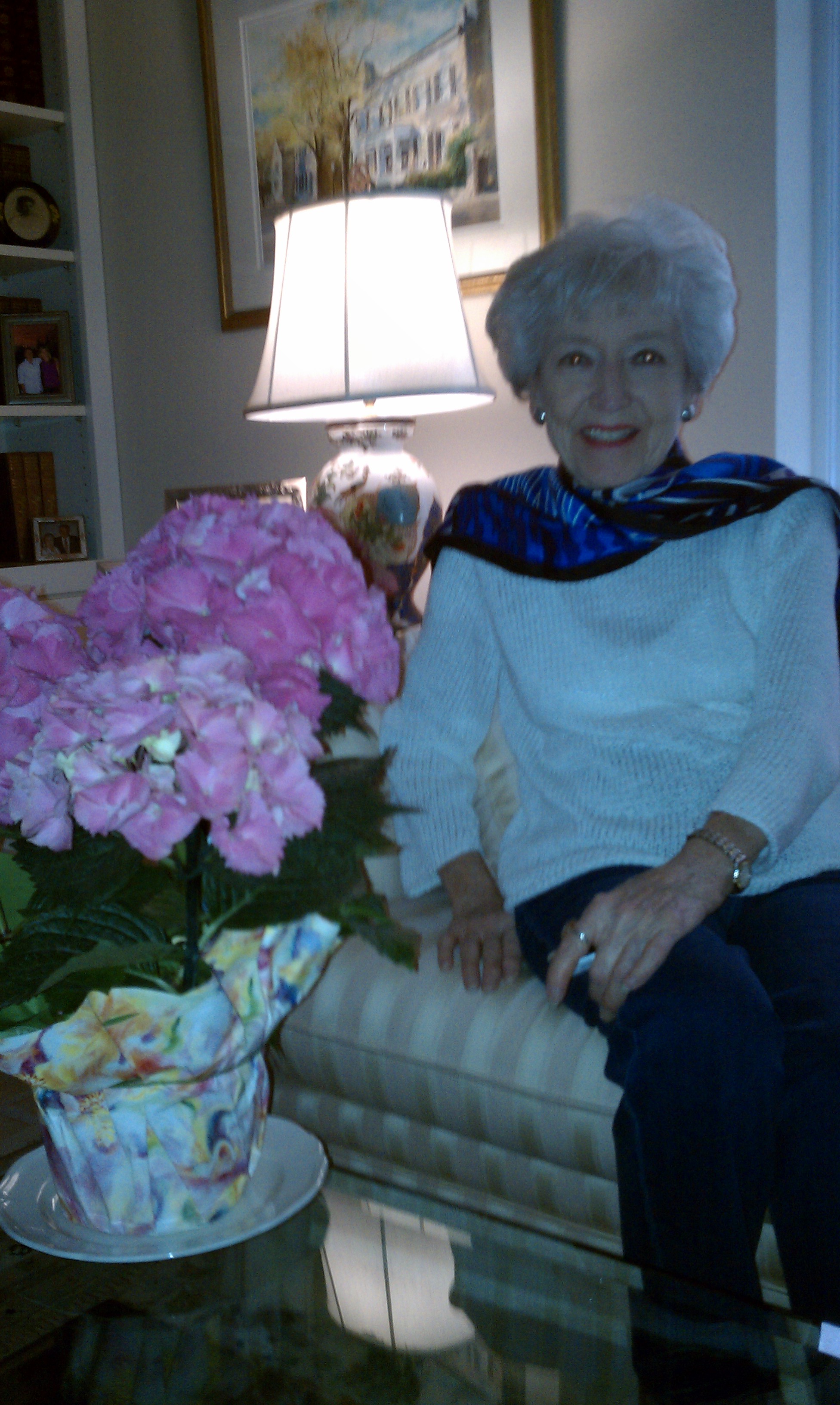
You want to feel great about coming home. It is your private space, it is your retreat. It is where you relax and restore and it is where you entertain and recreate. Indoor exercise space, home offices, functional kitchens, efficient space utilization, creative storage solutions, provisions for privacy, safety and security are all paramount to good intelligent design.
Aging in place…thinking about limited mobility seems an unrealistic concern…until a minor accident puts you in a temporary leg brace, crutches or wheel chair – is you home equipped to assist you to deal with this change in plans? If you never intend to move, can you really envision how you might need certain modifications to enjoy your home throughout the years?
We can come into your home and assist you in evaluating safety and accessibility issues for present and future consideration. There are helpful guidelines to make modifications to achieve maximum utilization and enjoyment of your home for many years to come.
Exterior design is equally as important – ease of maintenance, enjoyment , expansion of your living spaces, pet habitats, hobbies, etc…we can plan your landscape design, outdoor kitchens, sunrooms, covered patios, gardens, and anything that you can imagine to maximize the utilization and pleasure of your exterior spaces
Let us sit down with you to discuss your needs…your dreams. We will help you plan and achieve the maximum value for your budget. We can provide recommendations for an existing floor plan as well as assist in the evaluation of a prospective home purchase – all the way to helping you plan and design a new home with the experience and foresight of life’s changing needs.
We bring experience with a professional eye to critique, recommend, design and bring to reality your goals and dreams for a comfortable and secure life in your intelligent home.
.